The purpose of this thread is to inform budding digital artists (and perhaps some graphic artists alike) of the terminology used in many tutorials for most, if not all, of the basic features that come with digital art programs. If you feel some terms have been incorrectly defined, or wish to add onto the list, feel free to suggest some or post your own! It will be added into the OP (your post will remain).
Canvas: Like a real canvas, this refers to the space on which you're working on. Usually you start a new Canvas with the "base layer" that happens to be all-white.
Brushes: Each brush can serve a different purpose-- these are the tools you use to create lines, color in the image, etc. Many programs allow you to make your own custom brushes with unique textures and patterns, but many fellow artists provide brushes for download or provide their settings for you to mimic in your own copy of the program. Often, the brushes are named according to the texture or pattern akin to if you were to replicate it with traditional media, such as a Pencil Brush to mimic the graphite textures of a pencil. Depending on the application, there are resources that allow you to download these brushes for use-- we'll cover such things in a different thread.
Layer Transparency/Opacity: Transparency and opacity are interchangeable terms. Each layer can have the opacity individually set from zero opacity (in other words, transparent) to 100% opaque. Layers that are partially transparent will allow objects from layers below them to be partially visible. This is accessible in the layer's settings. Transparency in the bottom-most layer is usually indicated by the background having a gray and white checkered pattern rather than white (this varies between applications).
Clipping Mask: A group of layers to which a mask is applied. The bottommost (base) layer defines the visible boundaries of the entire group. For example, suppose you have a shape in the base layer, a photograph in the layer above it, and text in the topmost layer. If the photograph and text appear only through the shape outline in the base layer, they also take on the opacity of the base layer.
A Photoshop Example:

Clipping Layer: Either its own tool or a mode applied to an existing layer; typically, anything you do on this layer with clipping mask enabled will show on the layer directly below it (excluding any white space present on the layer). Here's a visual example:
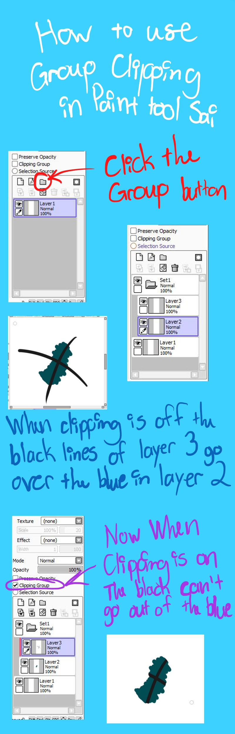
Courtesy of Diagonaleast at Deviantart.
BTW, you don't need to have a clipping group-set for the clipping layer to work, but it makes your layer system much more organized. Very useful for coloring your lineart if you have it on a separate label.
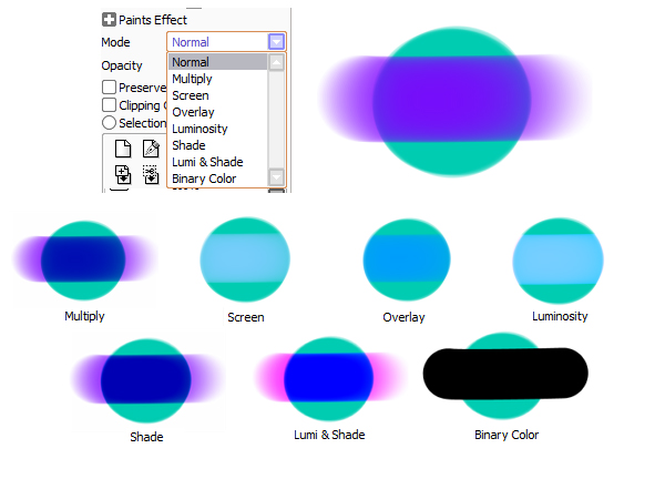
Layer Modes: The different settings a layer can have, which can have a profound effect on how the final product will turn out depending on the setting. The most common among art programs are Multiply, Overlay, Screen, and Luminosity. Each layer mode affects the look of the layer in a different way.
-Hue/Saturation
Color Accuracy (suggested by Freak)
Canvas: Like a real canvas, this refers to the space on which you're working on. Usually you start a new Canvas with the "base layer" that happens to be all-white.
Brushes: Each brush can serve a different purpose-- these are the tools you use to create lines, color in the image, etc. Many programs allow you to make your own custom brushes with unique textures and patterns, but many fellow artists provide brushes for download or provide their settings for you to mimic in your own copy of the program. Often, the brushes are named according to the texture or pattern akin to if you were to replicate it with traditional media, such as a Pencil Brush to mimic the graphite textures of a pencil. Depending on the application, there are resources that allow you to download these brushes for use-- we'll cover such things in a different thread.
ALL ABOUT LAYERS
Layer(s): Layers are like sheets of transparent paper that can be stacked on top of each other; when you click on one and proceed to draw, any changes you make will affect only that layer selected. It is very common for artists to do their pieces in layers (i.e. the bottom layer is for the sketch, the layer above is lineart only, etc), as it gives the artist the ability to make edits to any aspect of the work without forcibly altering other parts of the image (this can only be done with certain file types, which will be discussed later).Layer Transparency/Opacity: Transparency and opacity are interchangeable terms. Each layer can have the opacity individually set from zero opacity (in other words, transparent) to 100% opaque. Layers that are partially transparent will allow objects from layers below them to be partially visible. This is accessible in the layer's settings. Transparency in the bottom-most layer is usually indicated by the background having a gray and white checkered pattern rather than white (this varies between applications).
Clipping Mask: A group of layers to which a mask is applied. The bottommost (base) layer defines the visible boundaries of the entire group. For example, suppose you have a shape in the base layer, a photograph in the layer above it, and text in the topmost layer. If the photograph and text appear only through the shape outline in the base layer, they also take on the opacity of the base layer.
A Photoshop Example:
Clipping Layer: Either its own tool or a mode applied to an existing layer; typically, anything you do on this layer with clipping mask enabled will show on the layer directly below it (excluding any white space present on the layer). Here's a visual example:
Courtesy of Diagonaleast at Deviantart.
Layer Modes: The different settings a layer can have, which can have a profound effect on how the final product will turn out depending on the setting. The most common among art programs are Multiply, Overlay, Screen, and Luminosity. Each layer mode affects the look of the layer in a different way.
(courtesy of Anastasia Purtova. Check out her Painttool SAI Guide!)
Filters: These are useful for color adjustments after finishing the piece to being out the colors or selectively mute them. Usually will affect only the layer that you are currently working with. If everything is in one layer, it affects the entire image. Play around with the sliding scales to see how much or how little you feel would be just right for your photo. Typically, you manipulate these aspects by adjusting the slider which in turn is numerically an adjustment -- "0" is the default, or "no change". Either extreme of the slider scale goes into positive or negative numerical values.-Hue/Saturation
- Hue: Color. Just slide the scale around and watch the color palette gradually change through each known color group.
- Saturation: How vibrant (or dull) the colors are.
- Brightness: How close the colors are to black or white. Boosting the brightness makes the picture become whiter overall -- lowering brightness into negative values will bring the colors closer to black.
- Contrast: How stark the difference is between one color and another. Very useful for editing scanned black-and-white images to get rid of the gray color of the paper.
FILE TYPES
When you go to save your piece, you are typically prompted to select a file name and to choose a file type to save it as. There are indeed crucial differences between each type. Knowing the types when you save your art can come in handy and make life a bit easier.
.PNG (Portable Network Graphics): This file format is one of the most widely used lossless image compression format of this list. It's recommended to save your art as .png because image quality is not reduced upon image compression compared to JPGs/JPEGs. This is one of the only formats that lets you save images with transparent/translucent backgrounds.
.JPEG/JPG (Joint Photographic Experts Group): Compresses the image by discarding of data in a way that minimally affects the image quality, unlike PNG, which is lossless. Does not maintain transparency (instead, it fills the intended transparent areas with white), and is generally less suited for digital art compared to PNGs. Quality loss for this type is almost always a given when editing heavily or uploading through other websites. Scanned images are typically saved as this filetype, so many tend to edit the file slighty before saving it as a different format to edit further or post online. Good format for prints, from what I hear.
Saving pictures in either of these formats and then opening them in the program later will reveal that the image is completely on one layer, compared to the multiple layers you may have had before saving it.
.GIF (Graphic Interchange Format): Typically used for short animated drawings/looping images. Also is a valid format for still images, and maintains transparency when desired.
.PSD (Photoshop Document): Allows the user to work with the image's individual layers, even after the file was has been saved. It's crucial to keep on your computer in case you find a couple errors in the final product that need fixing ASAP without ruining other parts of the image by accident. It keeps all your layer information intact. Art applications besides Photoshop usually are able to open this file type.
.SAI: Serves the same purpose of a .PSD file, but is only able to be created by or opened with the Painttool SAI application. (SAI lets you open .PSD files too, by the way). You can export it as other file types in SAI when you go to save it.
.BMP (Bitmap): BMP images can range from black and white (1 bit per pixel) up to 24 bit color. Windows-written programs can read it easily, but typically this format is seldom used for saving art because it has limited support for compression of the image (most images are not compressed in this type and are pretty big for the storage space they take up anyway).
Color Accuracy (suggested by Freak)
This isn't exactly a technique so much as a term that describes how close the color you want to use looks on your screen compared to its actual appearance. When you color your images, always be aware of your device's brightness levels. This doesn't go without saying that you shouldn't be working too long with your brightness settings turned all the way up-- this can damage your eyesight and cause you to develop eye floaters and spots in your vision, along with causing eye strain. Additionally, think about how the colors may look to others and their screens-- be mindful that your color palette may lack the sufficient contrast and end up making your audience squint to really see what you drew. So don't be afraid to check over your drawing's color palette as you go!